By Yaldaz Sadakova

I never planned to make the Foreignish logo myself.
All the branding articles I’d read said you need to hire a professional to make sure your logo doesn’t look amateurish.
Originally, I had a designer in mind—somebody I already knew who had offered his services when I told him I wanted to create this website for memoir stories about immigration.
He was a fellow immigrant, and he had lived in several countries. He was part of my target audience.
I thought he’d be perfect for the job.
So, once I finally decided on the name Foreignish, I started thinking about the instructions I was going to give him about my desired logo.
I started brainstorming and drawing.
First I thought of the obvious stuff—a globe, a suitcase, an airplane.
But that was too clichéd. Especially since I wanted Foreignish to be a platform that looks at immigration through a more creative lens.
Then I thought about a bunny sitting in an open suitcase.
Bunnies are so cute, and I wanted the logo to look cute and artsy, not corporate and buttoned-down.
I could picture it clearly: a fat fluffy bunny with cute floppy ears and sweet round eyes. Possibly with a hair bow to make it extra cute.
Eventually I came to my senses.
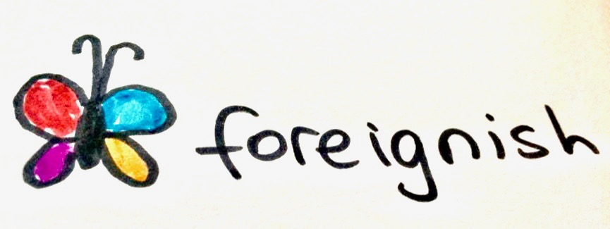
Then I thought of a butterfly with colorful wings.
The butterfly was going to symbolize the metamorphosis you go through each time you move to a different country.
The multiple colors in its wings were going to symbolize the diversity within immigrant communities.
But almost as soon as I finished drawing that, I thought it was too Animal Planet. Too childish.

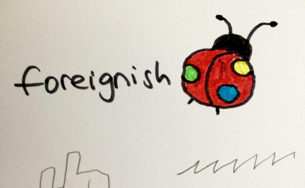
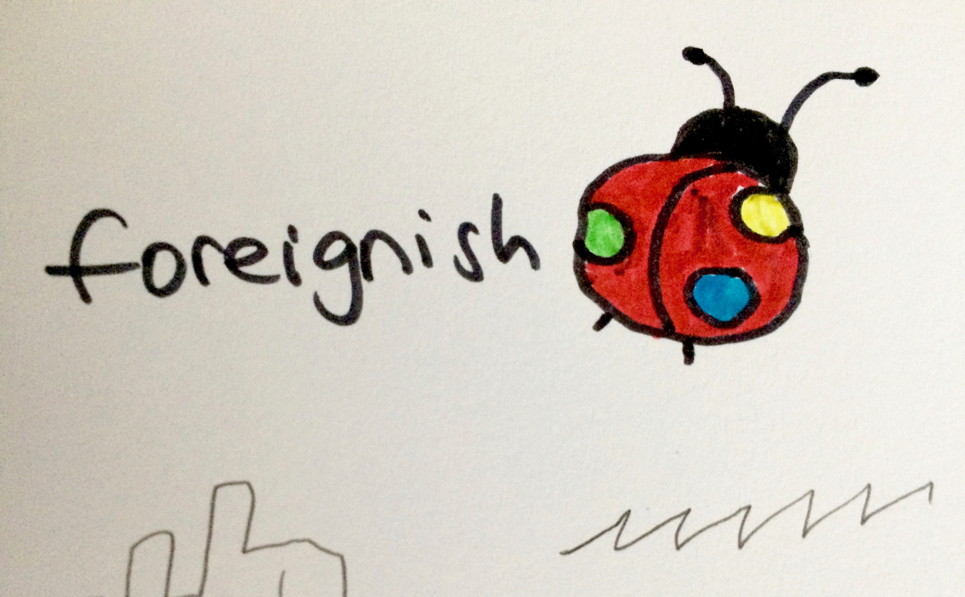
Then I drew a ladybug—the one on top of this page.
I purposely made it fat and rounded so that its shape would resemble the globe.
I loved the ladybug idea. It was so smart: hinting at the globe without explicitly depicting it.
I thought that was it. I was going to ask the designer to make me a cute ladybug-resembling-the-earth kind of logo.
Just then the designer emailed me.
He said that, after all, he wouldn’t be able to work on my logo because he was too busy, and he was so sorry.
But I didn’t feel bad. I actually felt relieved. I’d already started to worry whether I could afford the $1,000 he said he was going to charge me.
Maybe I could do this alone, I thought. I’d already been drawing and brainstorming. And I loved the prospect of saving $1,000.
I went to Google Drawings and tried to draw that cute fat ladybug.
The best I could come up with was this:

Much as I loved the ladybug, I had to let it go. I had to go for an image that was easier to draw.
What if I simply underline the name? I thought. Half of the line could be blue and wavy to signify water, and half of it could be green and straight to signify land.
Immigrants constantly move between land and water. It was perfect.

But when I actually made the logo, I thought these lines looked silly.
The whole thing looked like it had been made by someone sitting at home in her faded pajamas, someone who didn’t know what the fuck she was doing. Which, of course, it had been.
I felt stupid.
I decided there was going to be no image; the logo was going to be just the name Foreignish in a stylized font.
That’s what the articles about making your own logo advised anyway: with a DIY logo, just make it a stylized font and err on the side of simplicity.
I knew I wanted to stick to the handwritten and brush fonts to convey the handmade, personal nature of the immigration stories I wanted to publish.
So I started experimenting with those types of fonts.
I made about 20 logo versions. By the end of this experiment, I was cross-eyed. There were way too many fonts to choose from. It was overwhelming.
I could see why you would pay an artist to do it. Designing a logo, just like writing, is one of those things that looks deceptively easy until you try doing it yourself.
This is when I got the idea to add a black background as a simple way to make the logo more elegant.
I made more than 20 different versions with a black background.
When I made the version below, I thought that was it. Fore sure. It looked so handmade.

I sent it to the web developer I’d just hired. But when I saw this logo pasted on my website, I didn’t like it. It looked too busy.
And grainy. I didn’t have Adobe Illustrator, so I couldn’t produce a vectorized version of the logo to prevent it from looking pixelated when it’s condensed or blown up.
At that point, the web developer was mere days away from handing me the finished website.
I frantically made a new logo and sent it to her.
When she uploaded it on the website, it looked sharp; there was no pixilation. And it was simpler.
Fifty iterations or so later, I had finally arrived at it. ♦
ALSO READ

